
Your landing page is crushing it on paid media. Organic traffic is up 40% quarter over quarter. Your blog ranks for every head term in the category. And yet… the conversion funnel is flat. Trial signups are stalling, checkout abandonment is creeping toward 70%, and activation rates on the free plan haven’t budged in two quarters.
This is the quiet crisis of modern growth teams: plenty of traffic, not enough progression. The problem is rarely a single broken page. It’s that the experience between awareness and purchase is a patchwork of disconnected touchpoints—marketing says one thing, the product says another, and support is cleaning up whatever comes after.
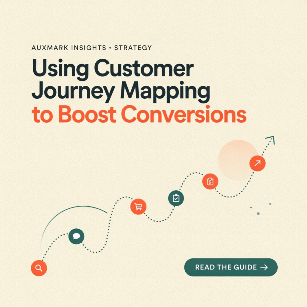
Customer journey mapping is the antidote. It’s the discipline of visualizing every step a prospect or customer takes with your brand, across every channel, with the specific intent of finding (and removing) the friction that’s quietly killing conversions.
In this guide, you’ll learn what a conversion-focused journey map actually is, the business case for building one, a step-by-step process to create it, the high-impact tactics that fall out of the work, how to measure the results, and the pitfalls that send most teams back to square one.
What Is Customer Journey Mapping?
Customer journey mapping is the process of diagramming the end-to-end experience a customer has with your brand—from first touch to renewal or advocacy—and annotating it with what they’re doing, thinking, and feeling at each stage.
It is not a marketing funnel. A funnel is a company-centric model of how you push people toward a purchase. A journey map is customer-centric: it shows the reality of how people actually move, including the detours, dead ends, and moments of doubt your analytics dashboard smooths over.
It is also not a persona. Persona mapping tells you who the customer is; a customer journey map tells you what that person experiences over time. Used together, they’re the sharpest diagnostic pair in the CRO toolkit.
A useful map has seven core components:
- Stages (awareness, consideration, purchase, onboarding, retention, advocacy)
- Touchpoints — every surface where the customer interacts with you (ads, SERPs, landing pages, emails, product UI, support tickets)
- Actions the customer takes at each stage
- Emotions — confidence, confusion, hesitation, delight
- Pain points and barriers — what slows or stops them
- KPIs tied to each stage (CTR, activation rate, time-to-value, churn)
- Internal ownership — which team is accountable for that slice of the experience
Done well, a map becomes the connective tissue between customer experience (CX), product, and growth—turning a pile of disconnected experiments into a coordinated funnel optimization program.
The Business Case: Why Journey Mapping Improves Conversions
Mapping the journey isn’t a design exercise. It’s a revenue intervention.
McKinsey’s research on customer-experience transformations finds that brands that successfully improve key customer journeys see revenue grow 10–15% while lowering the cost to serve 15–20%. In a separate study of banking clients, McKinsey reported that experience leaders delivered 55% higher total shareholder returns over a decade versus experience laggards. Forrester’s 2024 CX Index work shows the upside can be massive in absolute terms—improving CX by a single point can unlock over $1 billion in additional revenue for a mass-market auto brand, because small lifts compound across retention, renewal, and cross-sell.
The mechanism is straightforward. Most conversion leaks hide in the seams between touchpoints—the handoff from a paid ad to a landing page, from a welcome email to first login, from a pricing page to checkout. A map makes those seams visible. And once visible, each seam becomes a testable hypothesis:
- Higher conversion rate at the consideration-to-purchase step
- Faster time-to-convert through shorter forms and clearer next steps
- Higher activation rate by redesigning the onboarding experience
- Lower churn via churn reduction plays in the retention stage
- Higher average order value through contextual upsells at the right moment
Just as important, a journey map aligns marketing, product, CX, and sales around a single customer truth—killing the “it’s their part of the funnel” culture that stalls every growth program past the first quarter.
Step-by-Step: Build a Conversion-Focused Customer Journey Map
Most workshops die on a whiteboard. This process is designed to produce a working artifact tied to a specific conversion metric.
1. Prepare: set the goal and assemble the team
Pick one measurable goal: reduce trial-to-paid drop-off by 20%, lift checkout completion by 15 points, increase 30-day activation from 18% to 30%. Choose one primary persona to map first—your highest-LTV cohort, not your largest. Then pull in one person each from product, marketing, design, support, and analytics. Cross-functional presence is what separates a map that drives action from a map that lives in Notion.
2. Research: blend qualitative and quantitative inputs
A map built from assumptions is just fiction with sticky notes. Gather:
- Quantitative: GA4 conversion paths, funnel reports in Amplitude or Mixpanel, session recordings (FullStory, Hotjar), heatmaps, CRM pipeline data, journey analytics from platforms like Contentsquare or Adobe Journey Analytics.
- Qualitative: 8–12 customer interviews across stages, support-ticket tagging by topic, NPS and CSAT verbatims, sales-call transcripts, Win/Loss interviews.
The most underused source is behavioral segmentation: split your data by high-converters vs. drop-offs and look for what high-converters did differently in their first session.
3. Build the map
Lay out stages horizontally and layers vertically, then populate:
- Stages: awareness → consideration → purchase → onboarding → retention → advocacy.
- Touchpoints per stage: list every channel and surface. For a B2B SaaS buyer, awareness might include LinkedIn ads, G2 reviews, and a colleague referral; onboarding might include the welcome email, in-app tour, first-login checklist, and first support chat.
- Customer emotions: plot a sentiment line. The valleys in emotion almost always correlate with the valleys in your conversion funnel.
- Barriers: unclear pricing, slow page load, too many form fields, no mobile payment option, a confusing upgrade prompt.
- KPIs: one or two per stage. If a stage has no metric, it’s not being managed.
Suggested visual 1: a sample journey map with emotion line, touchpoints, and stage KPIs labeled.
4. Prioritize with an impact-effort (or ICE) matrix
You’ll generate 30+ friction points. Score each on Impact (expected lift on your chosen conversion metric), Confidence (how strong is the supporting data?), and Ease (engineering/marketing effort). ICE = $(I \times C \times E) / 10$. Pick the top three. This step is what prevents the classic “beautiful map, zero shipped changes” outcome.
Suggested visual 2: an impact-effort 2×2 chart with example friction points plotted.
5. Validate with experiments
Every prioritized friction point becomes an A/B test or a qualitative usability test. For large structural changes (a new pricing page, a rewritten onboarding flow), run a holdout group so you can measure true uplift rather than confounding it with seasonality.
6. Govern iteration
Assign a single owner of the map (usually a growth PM or CX lead). Put it on a quarterly review cadence tied to your OKR cycle. A map that isn’t updated is a map that’s already wrong.
High-Impact Tactics You Can Ship From Your Map
A journey map is only valuable if it produces changes. These six tactics are the most reliable producers of conversion lift once you’ve mapped the experience.
Personalization and behavioral segmentation. Tailor landing pages, CTAs, and nurture emails by journey stage and persona. A returning visitor who’s viewed pricing twice should see a different hero message than a first-session blog reader. Modern CDPs (Segment, mParticle) and ESPs (Braze, Customer.io) make this practical without a data-engineering project.
Onboarding experience redesign. Progressive disclosure beats the mega-tour. Ship a three-step activation checklist with an “aha” moment in step two, pair milestone emails to usage events, and use empty states in the product as onboarding real estate. The goal is getting users to the value moment in under 15 minutes.
Checkout friction reduction. Per Baymard Institute research, the average cart-abandonment rate hovers around 70%, with forced account creation, long forms, and lack of trust signals ranking among the top causes. Ship guest checkout, shorten fields, surface trust badges inline (not in the footer), and rewrite error copy to be human and helpful.
Cross-channel experience consistency. If your ad promises “No credit card required” and your landing page asks for one on line two, the prospect leaves. Audit messaging, offer, and social proof across paid, organic, email, and in-app. Inconsistency is a silent conversion killer.
Journey orchestration with behavioral triggers. Automate interventions: a cart-abandonment email within one hour, a re-engagement sequence for users inactive at day 14, an upgrade prompt the moment a free-tier user hits a usage ceiling. Orchestration is where journey-based marketing stops being theoretical.
Content mapping across TOFU, MOFU, BOFU. Match asset type to stage—SEO guides and comparison content at consideration; ROI calculators, case studies, and security documentation at decision. Audit your content inventory against the map; the gaps are usually where your funnel is leaking.
Measuring Success: KPIs and Analytics for Journey-Based CRO
If you don’t instrument the journey, you’re guessing.
Core KPIs to track by stage:
| Stage | Primary KPI | Secondary KPIs |
|---|---|---|
| Awareness | Traffic quality, CPC | Branded search lift |
| Consideration | Engagement rate, content depth | Email capture rate |
| Purchase | Conversion rate, checkout completion | AOV, time-to-convert |
| Onboarding | Activation rate | Time-to-first-value |
| Retention | Customer retention, NRR | Support ticket volume |
| Advocacy | NPS, referral rate | Expansion revenue |
The data stack you’ll actually use. GA4 for pathing, Amplitude or Mixpanel for product funnels, Hotjar or FullStory for session replay, your CRM (HubSpot, Salesforce) for pipeline, and a CDP to stitch identities across devices. For serious journey analytics, look at Contentsquare, Adobe Journey Analytics, or Quantum Metric.
Experiment design. Run segment-based A/B tests on the persona and stage you mapped, hold out a control group, and measure uplift over a statistically meaningful window (typically 2–4 weeks for mid-funnel changes, 6–8 weeks for retention effects). Use Johnson relative weights or similar derived-importance analysis to confirm which touchpoints are actually moving the top-line KPI, not just which ones feel broken.
Real-World Examples
B2B SaaS — onboarding activation. A project-management tool used session recordings to discover that 62% of new signups dropped off during a 9-field company-profile screen on first login. They moved the profile step to a progressive in-app prompt triggered after day 3 and added a 3-step quickstart tour. Activation within 7 days rose from 22% to 38% in eight weeks.
Ecommerce — checkout redesign. A mid-market apparel brand mapped its mobile purchase flow and identified four redundant address fields, a forced account gate, and no Apple Pay. After shipping guest checkout, field consolidation, and a wallet-pay option, mobile checkout completion improved by 17 points and overall revenue per session grew roughly 9%.
Financial services — retention. A regional bank redesigned its bill-pay and card-replacement journeys using a combined data-and-design approach. McKinsey reported the work generated a $2.3 billion lift in annual customer spend and a 28-point increase in satisfaction, moving the bank into the top three of its peer group within three years.
Common Pitfalls (and How to Avoid Them)
Most journey-mapping efforts fail in predictable ways:
- Mapping without data. Hypothetical maps are comforting and wrong. Every barrier needs a supporting metric or quote.
- Overcomplicating the map. Five personas × eight stages × twelve touchpoints = nobody reads it. Start with one persona, one metric, one stage.
- No cross-functional buy-in. If product and support aren’t in the room, the map won’t change the product.
- Stopping at purchase. The customer lifecycle extends through onboarding, retention, and advocacy. Post-purchase is often where the biggest CRO wins live.
- Measuring the wrong KPIs. Tracking NPS while your checkout conversion is bleeding 70% is a distraction. Tie every stage KPI to a revenue outcome.
The fix: ship one small, data-backed change within four weeks of finishing the map. Momentum beats perfection.
Quick Checklist: From Map to Conversion Wins
- [ ] Define a target conversion metric and baseline it today
- [ ] Select one priority persona (highest LTV cohort)
- [ ] Map the top 5 touchpoints in the leakiest stage
- [ ] Annotate emotions and barriers with real data or quotes
- [ ] Assign one KPI to every stage
- [ ] Score friction points with ICE and pick the top 3
- [ ] Scope A/B tests or usability studies for each top friction point
- [ ] Run a holdout group for structural changes
- [ ] Ship at least one experiment within 4 weeks
- [ ] Set a quarterly map review with a named owner
- [ ] Connect map KPIs to revenue reporting (LTV, NRR, AOV)
- [ ] Repeat with the next persona once cohort 1 shows lift
Conclusion and Next Steps
Customer journey mapping is the fastest way to turn a messy web of touchpoints into a coordinated conversion machine—but only if the map leads to shipped changes and measured experiments. The companies that win on conversions aren’t the ones with more traffic. They’re the ones that have drawn the map, identified the seams, and committed to closing them.
Your next step is small and concrete: pick one persona, one leaky stage (onboarding or checkout are usually the highest-ROI starting points), build a first-pass map in two weeks, and run a 4–8 week experiment tied to a single metric. If the lift is real, the next stage funds itself.